Sam Wander
 

MFA project at SVA // Concept + Design + Code

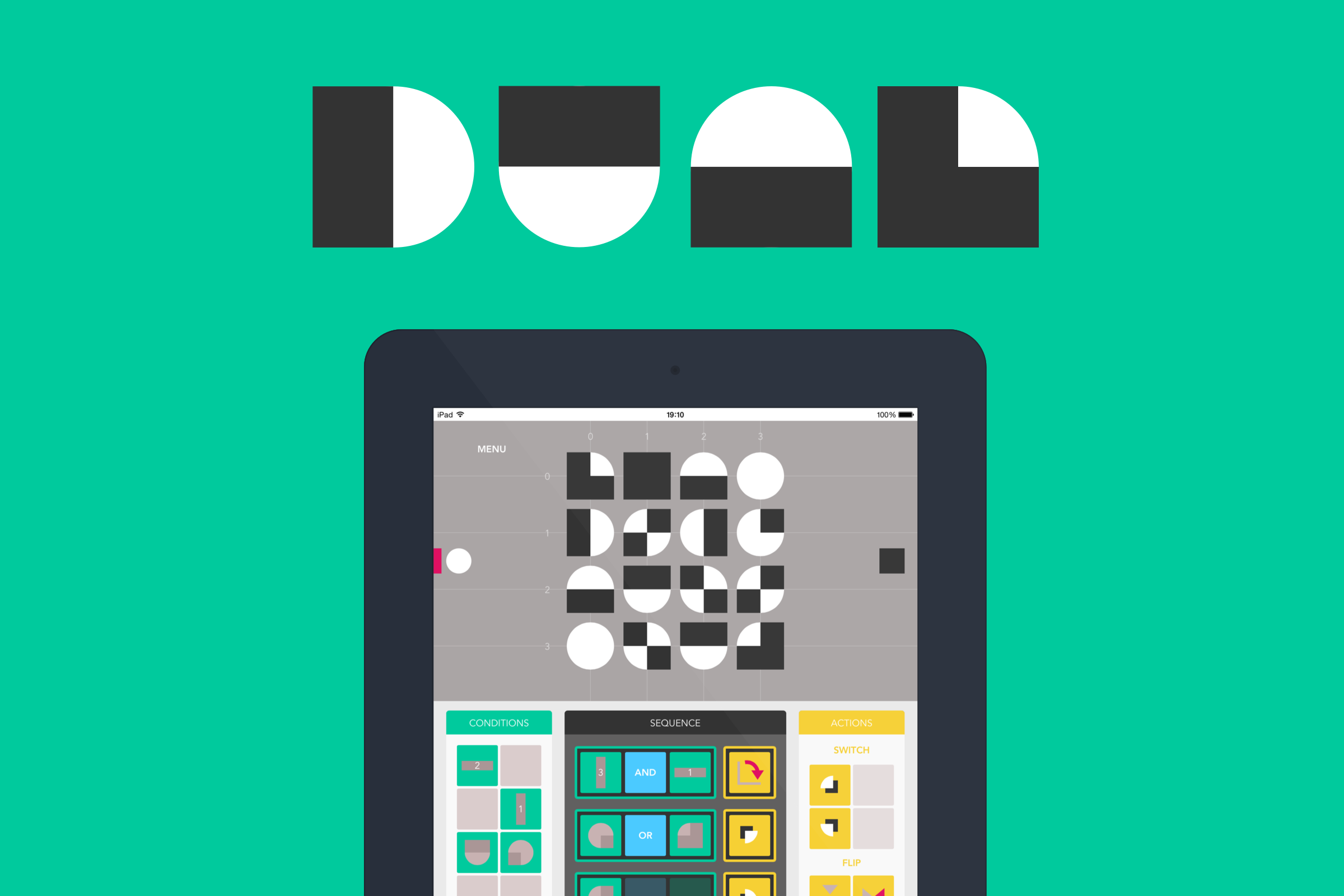
Conceived, designed and built in early 2015 for my graduate thesis, DUAL is an educational two player game for iPad that introduces basic programming concepts. Echoing classic board games, players battle to connect consecutive pieces on a grid. But rather than manipulate pieces directly, players must 'program' them – a process requiring sequential thinking and logic akin to programming itself.

The goal for DUAL is not to teach players to code, but to initiate them in computational thinking. This empowers them to better understand, critique, and imagine new uses for technology, as well as building skills for strategizing, problem-solving and creativity useful in everyday life.

As part of the project, I also built a website explaining what players learn through playing the game, and wrote a detailed account of the development process, including inspiration, motivation, and how I went about designing and coding the game. You can find all this, and download the game for free from the iPad App Store, by visiting playdual.com

Since launching in the App Store, DUAL has been downloaded hundreds of times across the USA, Canada, Latin America, Caribbean, Europe, Asia Pacific, India, Africa and Middle East.

Below is my thesis presentation at the SVA Theatre in Chelsea in May 2015, demonstrating how the game works, why I created it, and what I hope it achieves.

dual-index.png
 

MFA project at SVA // Concept + Experience Design

enlight is a smart desk light that enhances the reading experience for researchers, students and book lovers.

It brings features previously limited to eBooks to all books, however old they may be.

Unlike digital music, which has enough advantages for the majority of consumers to have eclipsed and mostly replaced physical formats, eBooks are likely to exist alongside physical books for the long run. Indeed, in the last few years eBook sales have slowed, but hardcover book sales have risen. This led James Surowiecki of The New Yorker to claim “co-existence is more likely than conquest”.

We wondered whether in a world where eBooks and printed media continue to co-exist we might miss some of the features eBook technology has made familiar. Furthermore, physical books have features many feel are missing from eBooks, particularly in an academic context. While linear reading can be great on a Kindle or other device, skipping around a non-fiction book for research purposes can be a frustrating experience. Image or diagram heavy books can also often be more pleasing to consume in print.

enlight utilizes computer vision, optical character recognition, a network connection to an array of data sources and projection-mapping technology to bring a wealth of smart features to print books and documents.

Users can highlight words to see definitions. If a passage is highlighted then contextual encyclopedia definitions, WolframAlpha statistics and other data are provided. They can also scan images and view social highlights from other users. Each highlight is saved in the left panel, though can be discarded by simply swiping away. In-page highlights can also be 'flicked' away to clear the page, without losing the saved highlight itself. Everything saved is synced with the cloud and may be viewed on other devices.

Concept produced with Leroy Tellez and Lucy Knops at SVA in New York.

enlight1.png
 

MFA Project work at SVA // Data Visualization + Prototyping

The MTA collect an array of detailed data on subway transit, but to date the organization has not found a way to utilize data visualization as part of their internal communications. SVA IxD ran a workshop where participants were tasked with creatively visualizing some of this existing data, to demonstrate what's possible and hopefully help inspire change within the organization.

My group looked specifically at fires on subway tracks.

We would look at the frequency with which fires took place, and try to identify possible causes. A known cause of fires is trash on the track, so one area of particular interest was how often cleaning took place (with Vacuum Trains).

Data examined included: the total number of monthly fires across the whole subway system, Vacuum Train activity (across one line), and delays during morning rush hour (also on one line only).

Along with the visualizations themselves, we delivered an interactive iPad prototype (built using Framer.js) which afforded the MTA team a chance to see how the visualizations might be used in the context of their board meetings.

Our hunch was that stations with more frequent vacuuming would see less fires, since less trash would be left on the tracks.

Unfortunately, the very limited data set did not conclusively support this. However, the visualizations set up a language and format where identifying such connections would be possible. If no connection is found with more data, the visualizations would help redirect attention towards other possible causes. 

Our thinking and deliverables were very well received by the team present in the final workshop.

Collabaration with Amy Wu and Hanna Yoon.

MTA.png
 

MFA project work at SVA // Concept Development + Video Production

A speculative wearable technology concept for the year 2046. Developed with Amy Wu, Matt Brigante and Melody Quintana on the theme of 'Self, Mindfulness, Presence, Awareness'.

Could we someday quantify our emotions? How might a "qualified self" manifest in future wearable technology, and what will it mean for society? Coloring is a concept that explores these questions.

Coloring is a hypothetical consumer health product that launches in the year 2046. By then, significant leaps in psychology and neuroscience research will have taken place, transforming our understanding of mental health. Innovations in materials technology will also introduce new possibilities for treatment, such as brain chip implants. Implants may very well become a social norm and be used, among other things, to regulate neurotransmission and hormone levels in the brain.

Coloring is a skin interface for people who use brain chip implants to track and manage their mental health. It communicates with the user's brain chip to display a real-time visualization of their emotional state, right in the palm of their hand. Emotions are mapped to a 7000-color spectrum. The spectrum is richer and more precise than our verbal emotional vocabulary, empowering people with a new language to understand their feelings. Rather than having to use blunt and unpredictable prescription drugs, users are given the agency to self-medicate when appropriate. They can simply blend harmonizing colors into their Coloring to balance their mood.

coloring2.png
 

MFA project at SVA // Concept + Coding (Processing)

Collaboration with Luke Stern. Merging location data with a modified Kinect camera image, we generated an ambient 'quantified self' visualization with a competitive twist. Data for each user (which for the prototype is me on the left, Luke on the right) is pulled from the Moves app API. The OpenNI library for Processing is used to access the Kinect camera. Using the activity and location data to modify the Kinect image, the app indicates progress towards a daily target of 8,000 steps or 5 kilometers travelled (the top of the screen is the target). By tracking the closest point towards the camera, users can switch between different days and the step or distance data. Additionally, by stepping towards the camera users can see maps of their movement around New York City, and by stepping even closer an info screen displaying text data.

The underlying idea is to visualize activity data ambiently. The app would appear on a screen in the home or at a workplace, and by stepping to it the user could check on their daily progress.

Limitations of the prototype / proof of concept are the users are hard-coded in, rather than different users being able to authenticate, and we constrained to visualizing only two users.

kinect3.png
 

MFA project at SVA // Concept + Construction + Coding (Arduino)

Sleeping is one of my weaker skills, and for some time I'd tracked patterns and quality with iPhone apps like Sleep Cycle. A view of my sleep activity was meaningful and useful data, and I liked the ingenuity of using the iPhone's accelerometer as an instrument for monitoring depth of sleep.

Having played with various sensors in our Physical Computing class, and used them to manipulate lights or other electronics, Leroy Tellez and I decided to build a more 'physical' version of a sleep tracking app. Rather than glance at a bright iPhone screen on waking up, you'd see a representation of your sleep with a kinetic wooden object.

A simple proof-of-concept, we chose to represent each hour of sleep with one wooden dowel, which would gradually swing from one side to the other depending on how much motion our accelerometer sensed over an hour (more motion means lighter sleep). The dowels were controlled by mini servo motors.

A future version would refine the physical construction, and use a more granular measure than one dowel per hour to show a more nuanced wave pattern.

sleep2.png
 

MFA project at SVA // Concept + Coding (jQuery)

A small programming project enabling me to learn about accessing OAuth APIs, parsing JSON data, using jQuery and other JavaScript libraries.

I began capturing each location I visited via the excellent Moves iPhone app. The app provides a daily view of where you've been, how you travelled between places, and how long each journey took. But it lacked a visualization of how long you stayed at each visited place, which I felt could be an interesting view of a day.

I used the Moment.js library to handle manipulation of time data, and the Snap.svg library to create graphics purely in code (no image assets were required). The longer I remained at a location, the larger the circle.

Predictably, the visualization confirmed the obvious: I spent almost all of my time during this period between the SVA Interaction Design studio and home.

places2.png
 

Proactive project at Albion London // Concept + User Experience + Product Management

site-screen.jpg

I wanted to solve a simple problem - remembering recommendations for movies, books etc. I observed that everyone had an individual way of augmenting their memories, such as noting movie titles in their notes app, or in a to-do list. Researching the issue, there was agreement that none of these solutions were perfect, and there was real enthusiasm for a better option. I began thinking about the power of making the app social, allowing you to follow friends' intended reading or watching lists. Since you'd likely trust their taste, there would be compelling potential for tailored content discovery.

My original wireframe concept was a website, but I quickly decided it needed to be 'mobile first' as it best suited the context of use - that moment where you want to ensure you don't forget a title mentioned in a conversation.

My colleague starting prototyping a mobile webapp using jQuery mobile. Before long I'd convinced directors at Albion London to give us time to design and build it a little more formally on company time.

We launched a webapp just in time for SXSW. It received great user feedback, there's been a lot of support for the idea. Unfortunately the project was paused at this point. If you're interested in helping me progress the idea send me a message.

queues2.png
 

Client project for Jose Cuervo at Albion London // User Experience

Howl is 'the easiest way to get your mates together for a night out'. Aimed at 18-25 year olds, the concept is to encourage the instigators in any social group to rally their friends, by inviting them to a location on Foursquare.

Building on social dynamics we observed in research, the app plays on the competitive element within (particularly male) social groups. They are like a 'pack', and friends vie for social points and leadership. With a humorous angle, points are scored for being more sociable (and lost for being antisocial) leading you to be a better or worse animal character in your pack. No one wants to be a worm. Being a suave lion, however, is pretty cool.

The app was produced for Jose Cuervo Tequila, but deliberately intended as 'utility first, brand second'. The down-playing of the brand was based on research, where we found significant aversion to or distrust for overly branded apps.

I led the user experience development, from early concept sketches through user testing to refined wireframes. I also worked closely with the visual designer on delivering a stylish, polished experience.

howl.png
howl.png